
Introduction to Looker Studio
Looker Studio is a powerful business intelligence platform designed to empower organizations to make data-driven decisions. At its core, Looker Studio enables users to create interactive and visually appealing dashboards that facilitate data analysis and interpretation. With an emphasis on user experience, Looker Studio offers a straightforward interface that allows even non-technical users to explore and engage with data effectively.
The relevance of Looker Studio in data visualization cannot be overstated. In today’s fast-paced business environment, the ability to analyze complex datasets quickly and accurately is crucial for making informed decisions. Dashboards serve as a centralized hub for displaying key metrics and insights, allowing stakeholders to monitor performance and identify trends at a glance. Looker Studio excels in this capacity, integrating various data sources and presenting them in a coherent format that enhances understanding.
One of the standout features of Looker Studio is its capability to create customizable visualizations that cater to specific business needs. Users can tailor their dashboards with various elements such as charts, tables, and graphs, ensuring the information presented is relevant and actionable. This customization not only aids in data comprehension but also plays a vital role in aligning with organizational goals and objectives.
Furthermore, Looker Studio’s ability to collaborate in real-time fosters a culture of data literacy within teams. Multiple users can grapple with dashboards simultaneously, share insights, and discuss findings, ultimately leading to more robust decision-making processes. As we delve into specific looker studio dashboards examples in the subsequent sections, it is essential to recognize how such tools have transformed data visualization and analysis for businesses across industries.
Importance of Effective Dashboards
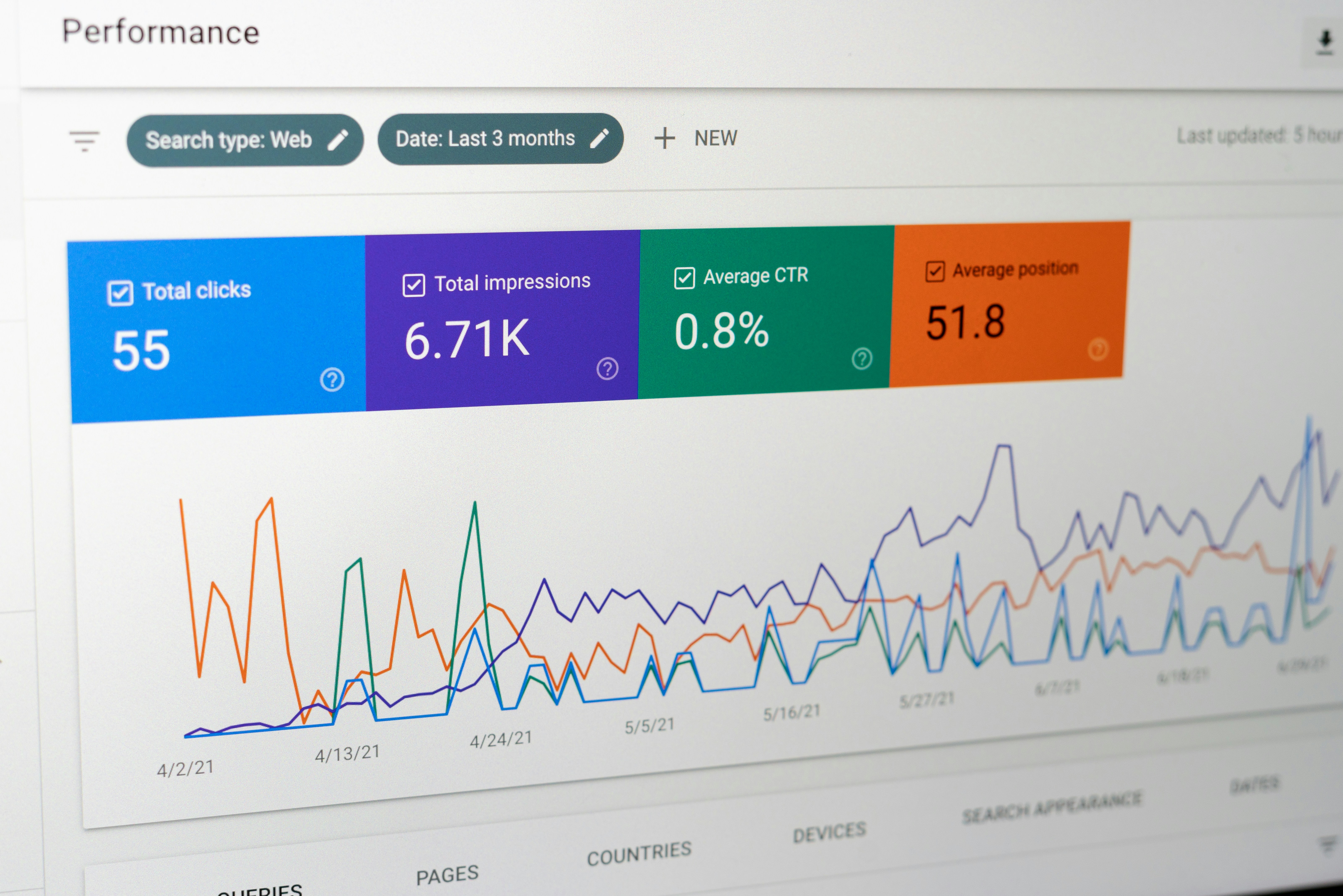
In today’s data-driven environment, the role of effective dashboards cannot be overstated. A well-structured dashboard serves as a vital tool for organizations, enabling decision-makers to visualize key metrics and trends. This visualization empowers stakeholders to make informed decisions swiftly, thereby enhancing operational efficiency. Looker Studio dashboards examples highlight how impactful data presentation can transform raw data into actionable insights, facilitating real-time analysis and strategic planning.
The benefits of clear data representation extend beyond mere aesthetics. Effective dashboards bring clarity to complex information, breaking down data silos and allowing stakeholders to engage with the content. When the information is easily digestible, it fosters a greater understanding across different organizational levels. This clear presentation also minimizes the likelihood of misinterpretation, which can lead to costly errors in strategic choices.
However, organizations often encounter challenges in creating dashboards that fulfill their varied needs. Misalignment between the dashboard’s purpose and the users’ expectations can result in a tool that fails to provide the necessary insights. Other common pitfalls include overcrowded interfaces, which can overwhelm users, and the lack of real-time data updates. To overcome these challenges, organizations must focus on the essential elements that make a dashboard effective, such as simplicity, user-centric design, and relevance of displayed information.
By prioritizing these aspects, companies can significantly enhance their dashboard experience. Leveraging Looker Studio dashboards examples can provide inspiration for creating visually appealing and user-friendly interfaces. Ultimately, an effective dashboard not only influences organizational performance but also fosters a culture of data-driven decision-making, where insights can be unlocked efficiently for better outcomes.
Example 1: Sales Performance Dashboard
A sales performance dashboard is a crucial tool for any organization looking to streamline its sales analysis. An exemplary Looker Studio dashboard focuses on key sales metrics that can effectively drive decision-making processes. This dashboard typically includes vital statistics such as revenue, lead conversion rates, and sales targets, all of which are essential for assessing the effectiveness of the sales strategy.
The revenue metric serves as the cornerstone for evaluating the sales team’s performance over a given period. It showcases not just the total income generated but can also be broken down by segments such as region, product, or sales representative. By visualizing this information through bar charts or line graphs, stakeholders can quickly discern trends and patterns necessary for informed business decisions.
Another crucial element within the dashboard is the lead conversion rate. This metric allows organizations to assess how effectively leads are being transformed into sales. Visual elements like pie charts provide a clear representation of the conversion process, highlighting gaps that may exist and uncovering opportunities for stronger marketing and sales efforts. This data is particularly powerful when analyzed alongside revenue figures, allowing teams to pinpoint where improvements can be made.
Sales targets, often displayed using gauge charts or progress bars, present a visual summary of the sales team’s performance against their objectives. These design elements not only add aesthetic value but also enhance usability by making performance evaluation more intuitive. Overall, a well-designed sales performance dashboard in Looker Studio combines these elements to offer a comprehensive view of sales effectiveness, streamlining the analysis and enabling quick responses to market changes.
Example 2: Marketing Campaign Dashboard
The Marketing Campaign Dashboard serves as a vital tool for marketers seeking to measure the performance of their campaigns effectively. Created using Looker Studio, this dashboard integrates various key performance indicators (KPIs) that are critical in evaluating the success of marketing initiatives. Among these, engagement rates, return on investment (ROI), and customer acquisition costs stand out as fundamental metrics that offer insights into the overall effectiveness of marketing strategies.
Engagement rates provide a measure of how well the target audience interacts with the content presented during a campaign. This metric can include various interactions, such as clicks, shares, comments, and time spent on promotional materials. By monitoring these figures through a Looker Studio dashboard, marketers can identify which areas generate the most interest and adjust their strategies accordingly. The real-time data visualization helps teams refine their tactics promptly, thus enhancing engagement potential.
Furthermore, ROI is an essential component of this dashboard, allowing marketers to track the financial implications of their campaigns. By comparing the total revenue generated from a specific campaign against the expenses incurred, marketers gain clarity on whether their strategies are providing sufficient returns. This straightforward analysis is pivotal for budget allocation and future campaign planning.
In addition to engagement and ROI, customer acquisition costs present another layer of insight. Understanding how much it costs to convert a lead into a customer allows businesses to streamline their marketing processes. As these costs fluctuate, insights drawn from the Looker Studio dashboards can offer benchmarks for performance improvement, ensuring that marketing efforts remain both efficient and effective.
In summary, the Marketing Campaign Dashboard exemplifies the power of Looker Studio in facilitating data-informed decision-making. By consolidating crucial metrics in a visually engaging format, it empowers marketers to track and optimize their campaign performance with ease and precision.
Example 3: Customer Support Dashboard
The Customer Support Dashboard is a vital analytical tool designed to enhance the efficiency and effectiveness of support services. This dashboard offers a comprehensive view of customer satisfaction metrics, ticket resolution times, and support team performance, enabling organizations to identify areas for improvement and drive strategic enhancements.
At the core of this dashboard is the emphasis on customer satisfaction, which is often captured through metrics such as Net Promoter Score (NPS) and Customer Satisfaction Score (CSAT). By visualizing these metrics, organizations can quickly ascertain how well their support teams are meeting customer needs. In addition to these quantitative measures, qualitative feedback from customers can also be integrated, providing a holistic view of the customer support experience. It allows companies to track trends over time, understanding how changes in operations may impact customer sentiment.
Another critical component of the Customer Support Dashboard is ticket resolution times. This metric provides insight into how efficiently support teams handle inquiries and concerns. Visualizations such as average response time, ticket backlog, and first contact resolution rates help pinpoint bottlenecks in the support process. By analyzing these data points, organizations can implement strategies to reduce response times and enhance service levels, ultimately leading to improved customer retention and loyalty.
Finally, evaluating support team performance is essential for maintaining high service quality. Metrics such as the total number of tickets resolved, individual agent performance, and escalations help managers gauge team productivity. With a clear view of performance across the team, leadership can identify high performers and those in need of additional training, ensuring that all team members can contribute effectively to overall customer satisfaction.
In essence, the Customer Support Dashboard serves as an indispensable resource for businesses aiming to refine their support processes and boost overall customer experience through data-driven insights.
Example 4: Financial Insights Dashboard
In the realm of data visualization, financing decisions critically rely on the analysis of key performance indicators (KPIs). The financial insights dashboard serves as a comprehensive tool, presenting a visual overview of essential financial metrics such as profit margins, expenditure tracking, and budget forecasting. By harnessing the power of these dashboards, businesses can streamline their financial assessment processes and enhance overall performance.
One of the primary functions of a financial insights dashboard is to provide clarity on profit margins. This feature allows companies to assess their profitability across various sectors, thereby enabling them to identify which departments are performing well and which require strategic adjustments. By visualizing profit trends over time, stakeholders can engage in proactive planning to enhance revenue generation and minimize losses.
Moreover, expenditure tracking is another vital component of a financial insights dashboard. It empowers organizations to monitor their spending patterns effectively. By categorizing expenses and visualizing them through charts or graphs, decision-makers can pinpoint areas of overspending or potential savings. This level of insight fosters informed financial decisions, ensuring optimal budget utilization. Additionally, with real-time data feeding into the dashboard, businesses can respond swiftly to emerging financial challenges.
Budget forecasting, integrated within these dashboards, supports organizations in predicting future financial performance. By analyzing historical financial data, businesses can determine appropriate allocation of resources and set realistic financial goals. This forward-looking perspective aids in anticipating cash flow requirements and planning for future investments, ultimately contributing to improved financial health.
In essence, the financial insights dashboard exemplifies how powerful data visualization can facilitate informed decision-making. By integrating vital financial indicators, businesses are better equipped to react to market changes and align their strategies with overarching financial objectives. Utilizing these looker studio dashboard examples enables organizations to attain a comprehensive understanding of their financial landscape.
Example 5: E-commerce Performance Dashboard
The e-commerce performance dashboard is a vital tool for businesses aiming to understand their online sales metrics comprehensively. It aggregates key performance indicators (KPIs) that illuminate customer behavior and sales trends, empowering stakeholders to make informed strategic decisions. This dashboard typically features essential metrics such as website traffic, conversion rates, and average order values, each of which plays a significant role in assessing e-commerce success.
Website traffic is one of the foremost indicators displayed in an e-commerce dashboard. By tracking visitor counts, businesses can gauge their marketing effectiveness and identify which channels are driving the most traffic. An increased volume of traffic can often lead to higher sales; however, it is crucial to consider conversion rates alongside this metric. The conversion rate reveals the percentage of website visitors who complete a purchase, offering insights into the efficiency of the sales funnel. A high conversion rate typically suggests effective product presentation and a seamless user experience, while a low rate may indicate potential barriers that need addressing.
Another crucial metric included in the dashboard is the average order value (AOV), which measures the average amount spent by customers per transaction. This metric is instrumental in evaluating the overall profitability of sales efforts. A well-designed dashboard may also incorporate comparative analytics, showcasing AOV trends over specified periods, allowing businesses to recognize patterns related to promotional campaigns, seasonal fluctuations, or market changes.
By leveraging these components of an e-commerce performance dashboard, businesses can acquire valuable insights into customer purchasing behavior and sales patterns. This enriched understanding aids in strategizing marketing efforts and refining product offerings, ultimately leading to improved performance. The effectiveness of the dashboard exemplifies how Looker Studio dashboards provide a visual interpretation of critical data, essential for growth and sustainability in the competitive e-commerce landscape.
Example 6: Social Media Insights Dashboard
In today’s digital landscape, social media serves as a pivotal tool for businesses aiming to enhance their online presence and engage with their audience effectively. A well-structured social media insights dashboard is essential for comprehensively tracking key performance indicators (KPIs), such as engagement metrics, follower growth, and campaign performance. Utilizing Looker Studio dashboards examples can provide remarkable benefits to companies seeking to optimize their social media strategies.
Engagement metrics are critical indicators of how well a brand’s content resonates with its audience. The dashboard allows for an intuitive visualization of likes, shares, comments, and overall interaction rates across various platforms. By regularly monitoring these metrics, organizations can identify high-performing content types and adjust their strategies accordingly. For instance, if video posts garner significantly more engagement than standard images, businesses can pivot their content creation efforts to prioritize video format, leading to improved audience connection.
Another vital aspect is tracking follower growth over time. By displaying this data visually, organizations can ascertain the effectiveness of their marketing campaigns and initiatives. A consistent rise in followers can often correlate with successful promotional activities or viral content, providing insights on what resonates with the audience. Additionally, if there is a stagnation or drop in numbers, it signals the need for a reassessment of the current social strategies, fostering a data-driven approach to content planning.
Campaign performance analysis through Looker Studio dashboards allows businesses to gauge the effectiveness of specific marketing efforts. By assessing metrics such as reach, impressions, and conversion rates, organizations can refine their campaigns to align better with audience preferences. Data-backed evaluations facilitate the continuous improvement of social media strategies, enabling businesses to remain competitive in a rapidly evolving digital environment.
Example 7: Project Management Dashboard
The Project Management Dashboard serves as a pivotal tool for teams aiming to enhance their efficiency and collaboration throughout project execution. By offering a clear visualization of key metrics such as project timelines, resource allocation, and task completion rates, this dashboard enables project managers and team members to track progress seamlessly. Utilizing Looker Studio dashboards examples specific to project management, teams can incorporate critical data points that highlight bottlenecks, resource shortages, or milestones achieved.
One of the essential features of the Project Management Dashboard is its ability to provide a consolidated view of ongoing projects in real-time. This ensures that all team members are aligned with project objectives and timelines. By visualizing timelines with Gantt charts or similar tools, teams can effectively manage deadlines and swiftly identify areas that require immediate attention. Additionally, the inclusion of resource allocation visuals allows teams to balance workloads appropriately, preventing burnout and optimizing productivity.
Task completion rates, another vital aspect tracked by this dashboard, are crucial for assessing team performance and promoting accountability. By displaying individual and group progress, team leaders can celebrate achievements or swiftly address lagging tasks. Integrating feedback loops within the dashboard can also foster a culture of continuous improvement, encouraging team members to share insights on task execution and project design.
Furthermore, the interactive components of a Project Management Dashboard empower teams to modify views based on specific needs. This adaptability means that team members can filter information based on the relevant project phase or team assignments, leading to more focused discussions in meetings and strategizing sessions. Overall, these Looker Studio dashboards examples exemplify how enhanced visualization can lead to more informed decision-making and streamlined project execution.
Conclusion and Best Practices for Creating Dashboards
As we reflect on the various Looker Studio dashboards examples discussed in this blog post, it becomes evident that effective data visualization requires a thoughtful combination of clarity, functionality, and aesthetic appeal. The key takeaway is that an impactful dashboard is one that not only presents data clearly but also engages users in a meaningful way. To achieve this, several best practices should be considered.
First and foremost, selecting the right data is paramount. Ensure that the data you choose is relevant and directly aligns with your dashboard’s objectives. This means conducting a thorough analysis of the insights your audience seeks and determining which metrics are most valuable. In doing so, you can focus on essential KPIs that drive decision-making without overwhelming users with unnecessary information.
Next, the choice of visualizations plays a crucial role in conveying your message effectively. Utilize charts, graphs, and tables that best represent your data. For instance, bar graphs are excellent for comparing categories, while line charts excel in displaying trends over time. Taking advantage of various visualization tools available in Looker Studio can enhance your dashboards significantly.
Moreover, maintaining user engagement through design is vital. A clean and organized layout, paired with intuitive navigation, allows users to interact with the dashboard seamlessly. Consider employing consistent color schemes and typography to enhance readability and provide a cohesive look. Additionally, incorporating interactive elements can drive deeper exploration of the data, making the dashboard not only informative but also compelling.
In conclusion, by applying these principles drawn from various Looker Studio dashboards examples, one can create more effective and engaging dashboards that cater to the needs of users, ultimately leading to better interpretative insights and informed decision-making.