
Introduction to Looker Studio
Looker Studio is a powerful data visualization and business intelligence tool that enables users to transform raw data into meaningful insights through interactive dashboards and reports. It is particularly beneficial for businesses and sales teams seeking to enhance their analytics capabilities. One of the standout features of Looker Studio is its ability to connect to various data sources seamlessly, allowing for real-time reporting and visualization. This connectivity supports the creation of a comprehensive Looker Studio sales dashboard that reflects accurate, up-to-date information.
The primary purpose of utilizing a dashboard in sales analytics is to consolidate data, visualize trends, and generate actionable insights that drive business decisions. Looker Studio facilitates this by providing an intuitive interface that enables users to craft customized dashboards that suit their specific needs. The platform’s flexibility supports a range of visualization options, including charts, tables, and graphs, allowing stakeholders to interpret complex data sets quickly and effectively. Moreover, the collaborative nature of Looker Studio enhances team alignment by enabling real-time data sharing and discussions amongst team members.
Using a Looker Studio sales dashboard, organizations can monitor key performance indicators (KPIs) and metrics in one centralized location. This holistic view not only assists in tracking sales performance but also empowers teams to identify opportunities for growth and improvement. Furthermore, Looker Studio encourages data-driven decision-making, ensuring that sales strategies are informed by the latest insights. By utilizing Looker Studio’s features, businesses can ultimately enhance their sales effectiveness and operational efficiency, paving the way for sustained growth and success.
Setting Up Your Looker Studio Account
To begin utilizing the Looker Studio for your sales dashboard, the first step is to create an account. This process is fairly straightforward and can be broken down into several manageable steps. Begin by visiting the official Looker Studio website where you will be presented with options to sign up. Here, you can choose between several pricing plans that best fit your needs and budget.
Looker Studio offers a free tier, which is ideal for first-time users or those who wish to explore its capabilities without financial commitment. However, if you anticipate scaling your operations or require advanced features such as custom data connectors and enhanced collaboration tools, consider opting for one of the paid plans. Carefully review the benefits of each level, as selecting the appropriate plan will significantly impact how you manage your Looker Studio sales dashboard.
Upon selecting your pricing plan, proceed with the registration process. You will need to provide basic information such as your name, email address, and a secure password. Following your registration, an email confirmation will be sent to verify your identity. Once verified, you can log in to your newly created account and commence the setup process.
The Looker Studio interface is user-friendly, yet can be overwhelming at first glance. As a newcomer, take time to familiarize yourself with the dashboard layout, tools, and various features available. Utilize the provided tutorials and documentation to help navigate the platform effectively. Your first task will involve linking your data sources, a crucial step in displaying relevant metrics on your sales dashboard. By following these guidelines, you will be well-placed to optimize your Looker Studio experience and create a data-driven sales dashboard that meets your organizational needs.
Connecting Your Data Sources
Establishing a strong connection between your data sources and Looker Studio is a critical first step in crafting an effective sales dashboard. The quality and accessibility of your data will significantly impact the insights generated from your reports. Looker Studio provides various data connectors that allow users to seamlessly integrate diverse data sources. Among the most widely used connectors are Google Sheets, BigQuery, and several Customer Relationship Management (CRM) systems, such as Salesforce and HubSpot.
To connect Google Sheets, for instance, you simply need to authorize Looker Studio to access your Google account and select the specific spreadsheet containing your sales data. This effortless integration ensures that your dashboard reflects real-time changes made to your data sheet, enhancing the timely nature of your sales reporting. Similarly, for BigQuery, you can link massive datasets directly from your Google Cloud Platform, which is particularly beneficial for organizations that require robust data handling capabilities.
When connecting to CRM systems, it is essential to ensure that all relevant fields and parameters are correctly mapped to optimize data flow into Looker Studio. This process includes verifying that lead statuses, pipeline stages, and sales metrics are accurately represented in the dashboard. Additionally, conditioning your data by cleaning and organizing it prior to integration can significantly improve the overall performance of your sales dashboard. It is advisable to set up an automated process if your data sources are frequently updated, thus maintaining data accuracy and relevance over time.
Ultimately, a well-configured data connection to Looker Studio lays the groundwork for insightful analysis and enhances strategic decision-making in sales performance. The insights derived from combining various reliable sources can effectively inform sales strategies, allowing organizations to fine-tune their approach for better results.
Designing Your Sales Dashboard Layout
Creating an effective sales dashboard in Looker Studio requires careful consideration of layout and design elements. A well-structured layout enhances user experience and allows stakeholders to grasp critical sales metrics quickly. Begin by organizing your dashboard into distinct sections that represent various categories of sales data, such as sales performance, revenue trends, and individual sales team achievements. By using grids or cards, viewers can effortlessly navigate through the information, ensuring that the most relevant data is readily accessible.
When selecting a color scheme, opt for a palette that reflects your brand while ensuring visual clarity. A limited color range helps prevent overwhelming users, while contrasting colors can draw attention to key performance indicators (KPIs). For example, use a neutral base color for most elements and bolder shades for important metrics. Additionally, incorporate white space effectively to enhance readability and avoid visual clutter.
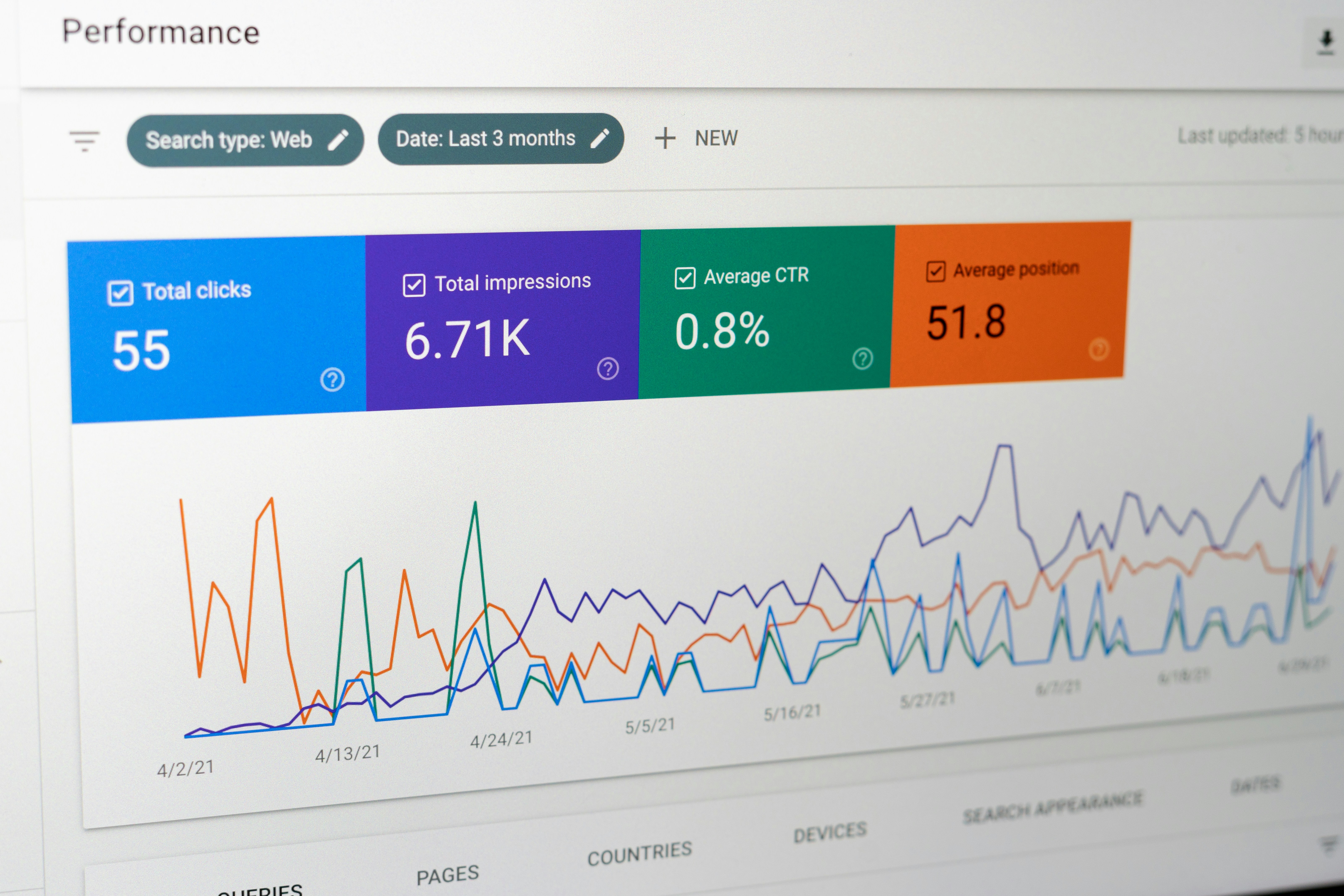
The choice of visualizations plays a crucial role in the overall effectiveness of your Looker Studio sales dashboard. Bar charts, line graphs, and pie charts each serve specific purposes in portraying sales data. Bar charts are ideal for comparing sales figures across different periods or product categories, while line graphs efficiently represent trends over time. Pie charts can be useful for illustrating sales contributions from various teams or regions. Choose visualizations that highlight the key insights you wish to convey, and ensure they are appropriately sized for easy interpretation.
To further enhance the usability of your dashboard, consider incorporating interactive elements that allow users to filter or drill down into specific data points. Engaging users in this way not only fosters a better understanding of the data but also enables them to identify actionable insights tailored to their needs. Following these design best practices will lead to a functional and aesthetically pleasing sales dashboard in Looker Studio that serves its intended purpose effectively.
Key Metrics to Include in Your Sales Dashboard
Creating an effective sales dashboard in Looker Studio requires careful consideration of the metrics that will best provide insights into sales performance. One of the most fundamental metrics to include is total sales. This figure represents the overall revenue generated in a specific period and offers a clear measure of success. By monitoring total sales, businesses can set revenue targets and strategize effectively to achieve them.
Another vital metric to consider is sales growth, which compares sales over different periods and highlights trends in performance over time. Understanding sales growth allows businesses to identify seasonal trends or shifts in consumer behavior, enabling them to adjust their sales strategies accordingly. With visualization in Looker Studio, stakeholders can quickly assess the growth rate, facilitating informed decision-making.
Lead conversion rates also play a critical role in analyzing sales effectiveness. This metric indicates the percentage of leads that are converted into actual customers, providing insights into the efficiency of the sales process. By tracking lead conversion rates over time, businesses can identify areas for improvement, such as the need for refined sales techniques or enhanced customer engagement strategies.
Additionally, customer acquisition costs (CAC) must be factored into any comprehensive sales dashboard. CAC represents the total cost involved in acquiring a new customer, calculated by summing marketing and sales expenses and dividing by the number of new customers acquired during that period. This metric helps businesses evaluate the effectiveness of their marketing campaigns and sales efforts while also assessing profitability margins.
Incorporating these key metrics into your Looker Studio sales dashboard not only fosters a better understanding of sales performance but also informs strategic decisions that can drive revenue growth. The clarity offered by visual data representation aids in pinpointing strengths and weaknesses within sales operations.
Leveraging Filters and Drill-Downs for Deeper Insights
In the world of data analytics, effectively utilizing filters and drill-down capabilities is critical for developing a comprehensive sales dashboard in Looker Studio. These functionalities offer users the ability to refine their data views, enabling targeted analysis that can uncover valuable insights. Implementing filters allows users to isolate specific data sets based on criteria such as time periods, regions, product categories, or sales representatives. This focused approach not only improves the clarity of the information but also empowers stakeholders to make informed decisions based on precise metrics.
Drill-down features further enhance the user experience and analytical depth. With this capability, users can click on summarized data to reveal more granular information. For instance, when examining total sales figures, one can drill down to see the sales performance of individual products or specific time frames. This hierarchical approach means that the data can be navigated intuitively, allowing users to explore underlying trends without losing sight of the broader sales context. Additionally, this level of interactivity engages users, encouraging them to explore data in a more meaningful way.
By strategically incorporating filters and enabling drill-downs within the Looker Studio sales dashboard, companies can transform vast amounts of data into actionable insights. These features not only aid in tracking sales performance but also assist in identifying strengths, weaknesses, and opportunities within the sales pipeline. Ultimately, the integration of filters and drill-downs fosters a data-driven culture that can significantly enhance strategic planning and operational efficiency. Users are likely to find that their ability to analyze sales dynamics improves considerably, leading to more informed decision-making and better business outcomes.
Integrating Advanced Analytics Features
Among the many robust functionalities offered by Looker Studio, integrating advanced analytics features is crucial for creating a comprehensive sales dashboard. Utilizing trend lines is one effective method for visualizing sales data over time. By incorporating trend lines into your dashboard, you can easily observe growth patterns and seasonal fluctuations. This visual representation not only helps in understanding past performance but also in predicting future sales trajectories.
Forecasting capabilities within Looker Studio further enhance the analytical power of your sales dashboard. These tools enable users to generate sales forecasts based on historical data. By employing time-series analysis, you can set realistic sales targets that align with observed market behaviors. This strategy not only aids in planning but also empowers teams to strategize effectively, ensuring resources are allocated efficiently to optimize sales results.
Another significant feature to consider is anomaly detection. Implementing this tool allows users to automatically identify unusual trends or outliers in the sales data. Recognizing sudden spikes or declines promptly can facilitate rapid decision-making. By integrating anomaly detection into your looker studio sales dashboard, you can mitigate risks and take proactive measures to address any underlying issues. For instance, if an unexpected drop in sales occurs, teams can quickly investigate potential causes and adapt strategies accordingly.
Effectively utilizing these advanced analytics features—trend lines, forecasting, and anomaly detection—ensures that your looker studio sales dashboard is not only a tool for data visualization but a critical asset for driving strategic decision-making. By embracing these capabilities, organizations can take informed and timely actions that significantly enhance sales performance and uncover valuable insights.
Sharing and Collaborating on Your Dashboard
Effective collaboration is a crucial aspect of utilizing Looker Studio for developing a comprehensive sales dashboard. One of the platform’s strong points is its intuitive sharing capabilities, which enable users to provide access to team members and stakeholders, fostering an environment of continuous feedback and improvement. When creating a looker studio sales dashboard, ensuring that relevant stakeholders can view and interact with the data is essential for driving informed decision-making.
Looker Studio provides a range of sharing options, making it easy to control who sees your dashboards. You can share your dashboard via a simple URL link, which can be customized for visibility settings. Additionally, users have the option to share dashboards directly within their organization or with external parties, enhancing the flexibility required for various business models. It is vital to carefully manage permissions while sharing. Looker Studio allows you to assign different roles, such as “Viewer” or “Editor,” to collaborators, ensuring the right level of access suited to their needs and responsibilities.
When collaborating within Looker Studio, it is advisable to establish best practices for feedback collection. Engaging with your team throughout the design process of your sales dashboard can lead to better insights and visualizations. Utilizing the commenting feature allows collaborators to leave notes and suggestions directly on the dashboard, which streamlines communication. Furthermore, integrating regular review sessions can maximize the efficiency of this collaborative effort, as it allows team members to discuss changes and address questions in real-time.
In conclusion, sharing and collaborating on your looker studio sales dashboard requires thoughtful consideration of permissions, sharing methods, and communication strategies to ensure that team members and stakeholders can contribute effectively. By fostering an inclusive collaborative environment, users can better harness the power of data visualization and analytics.
Maintaining and Updating Your Sales Dashboard
Implementing a successful Looker Studio sales dashboard is just the beginning; regular maintenance and updates are crucial to ensure that it remains a valuable tool for informed decision-making. As business environments are dynamic, adapting the dashboard to reflect current data and evolving business needs is essential. One approach to maintaining accuracy is to establish a routine schedule for data refreshes. Depending on the nature of your business and data flow, refreshing the data daily, weekly, or monthly can be effective. This ensures that stakeholders are presented with the most relevant information, allowing for timely insights.
In addition to scheduling data refreshes, it is important to monitor the performance of your Looker Studio sales dashboard. Keep an eye on load times and responsiveness; if users are experiencing delays, it may indicate the need for optimization. This can involve simplifying complex visualizations, limiting the volume of data displayed at one time, or ensuring that the underlying data model is efficient. User feedback is also invaluable; regularly soliciting input from stakeholders can help identify areas for improvement and ensure that the dashboard meets their needs.
Furthermore, revising key metrics is critical as business priorities shift. As your organization evolves, so must your performance indicators. Regularly assess whether the metrics being tracked continue to align with your strategic goals. If necessary, adjust them based on changing trends or new projects. This iterative process not only enhances the effectiveness of your sales dashboard but also contributes to its sustainability as a tool for driving business success.
In conclusion, maintaining and updating a sales dashboard in Looker Studio is an ongoing process that encompasses regular data refreshes, performance monitoring, and occasional metric revisions. By prioritizing these tasks, you can ensure that your dashboard remains a relevant and powerful asset for your organization.