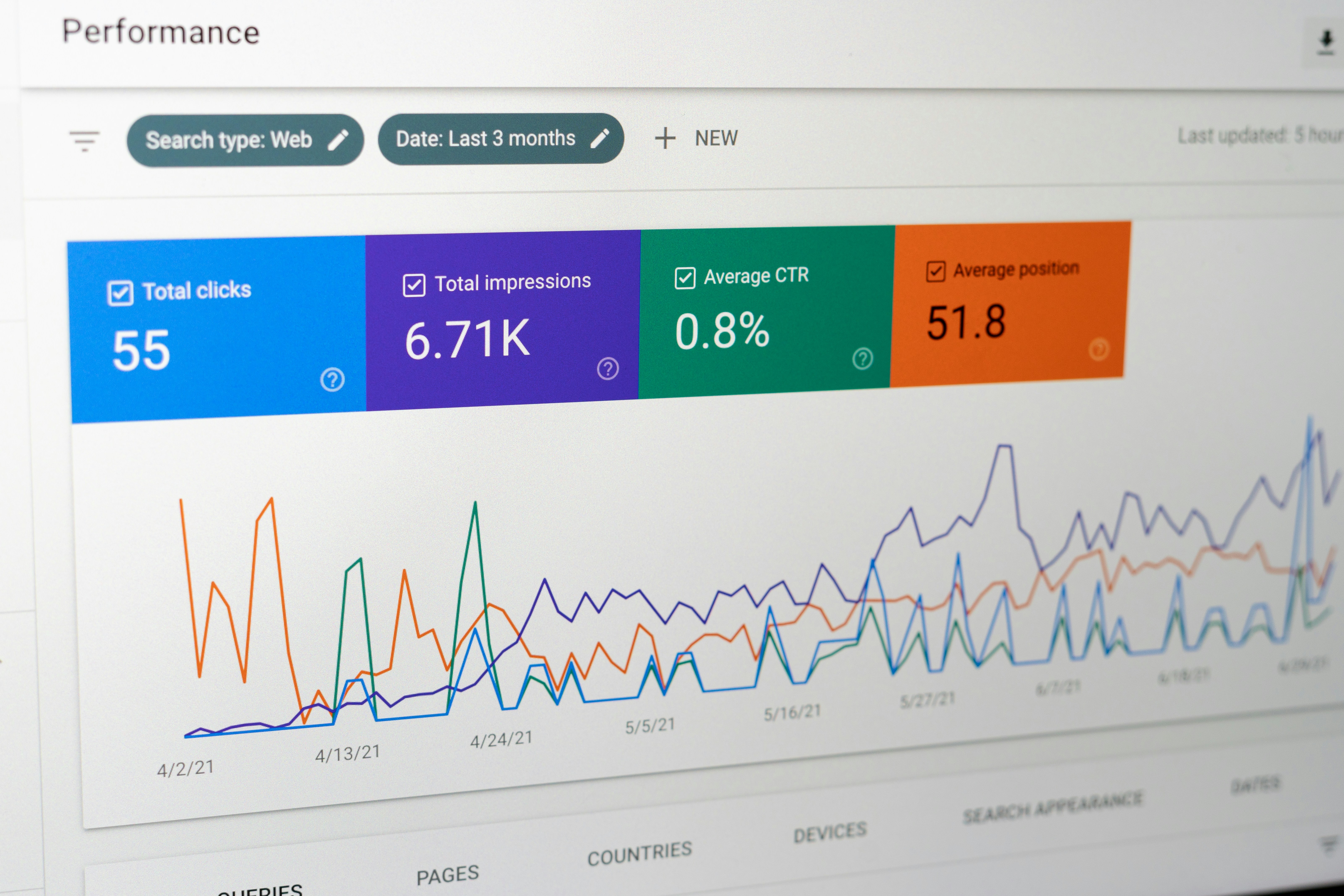
Introduction to Looker Studio
Looker Studio serves as a crucial platform in the realm of data visualization, enabling businesses to effectively collect, analyze, and present data in a manner that is both engaging and insightful. Designed to bridge the gap between data and decision-making, Looker Studio offers users the tools necessary to turn raw data into informative visual representations, facilitating a more comprehensive understanding of complex datasets.
The importance of Looker Studio lies in its ability to transform data into actionable insights. Businesses today are inundated with vast amounts of information, making it increasingly challenging to draw conclusions and make informed decisions. Looker Studio addresses this challenge by providing an intuitive interface that allows users to create interactive dashboards and reports that highlight key performance indicators and trends. This enhances user engagement and promotes a data-driven culture within organizations.
One of the standout features of Looker Studio is its flexibility and customization capabilities. Users can tailor their dashboards to reflect specific business objectives, ensuring that the displayed metrics are relevant and aligned with organizational goals. Furthermore, Looker Studio supports real-time data integration from various sources, allowing businesses to stay current with their analytics. This feature is particularly beneficial in fast-paced environments where timely insights are paramount to maintaining a competitive edge.
The upcoming sections of this blog post will delve deeper into the key functionalities and features of Looker Studio, providing a comprehensive exploration of how businesses can leverage this powerful tool to enhance their data visualization strategies. Through a thorough understanding of these elements, organizations can harness the full potential of a Looker Studio dashboard, fostering more informed decision-making processes.
Key Features of Looker Studio
Looker Studio is lauded for its robust capabilities that cater to diverse data reporting needs, making it a preferred choice among professionals. One of its standout features is data blending, which enables users to combine data from multiple sources seamlessly. This feature is particularly beneficial for organizations that utilize various databases, allowing users to gain a unified and comprehensive view of their data landscape. By blending data, stakeholders can derive more insightful analysis, highlighting trends that might remain hidden when observing a single source.
Advanced filtering options represent another crucial aspect of Looker Studio. Users can implement intricate filters to narrow down their datasets swiftly, ensuring that only relevant information is showcased in their reports. This flexibility facilitates targeted analysis, allowing users to focus on specific metrics that matter most to their objectives. For example, a marketing team can filter their dashboard to display only the performance data related to a particular campaign, thus enhancing the quality of their insights and decision-making processes.
Customizable visuals further enhance the effectiveness of Looker Studio dashboards. Users can tailor their visuals to align with their unique branding guidelines or to emphasize particular data points that are critical to their analysis. The ability to choose from a variety of chart types and layouts means that users can create dashboards that are not only informative but also visually engaging. This can significantly improve stakeholder engagement, as a well-designed dashboard captures attention and conveys information efficiently.
Lastly, the cross-platform compatibility of Looker Studio ensures that users can access their dashboards from different devices, whether it’s a desktop, tablet, or smartphone. This flexibility is essential in today’s fast-paced business environment, where data accessibility on-the-go can influence timely decision-making. By leveraging these key features of Looker Studio, users are well-equipped to develop insightful and effective dashboards that drive organizational success.
Understanding Your Data Needs
Establishing a clear understanding of your data needs is crucial before embarking on the creation of an effective Looker Studio dashboard. This initial stage involves comprehensively conducting a needs assessment, which identifies the specific information required to meet your business objectives. By taking time to assess these needs, organizations can ensure that their dashboards are tailored to provide relevant insights that drive decision-making processes.
Key performance indicators (KPIs) play a fundamental role in this assessment. Selecting the right KPIs requires careful consideration of what metrics align with your overall business goals. These indicators serve as quantifiable measures that will help you evaluate the success of your initiatives. When defining these KPIs, ensure they are specific, measurable, achievable, relevant, and time-bound (SMART). This approach not only streamlines the data you collect but also enhances the effectiveness of your Looker Studio dashboard by focusing strictly on what is essential for performance tracking.
Next, it is imperative to align the chosen features of your dashboard with your organizational goals. This alignment guarantees that your Looker Studio dashboard provides not just data, but actionable insights that contribute to strategic decision-making. It is advisable to include visual elements that translate complex data points into understandable formats, such as graphs or charts, which facilitate easier interpretation of trends and performance levels. Engaging stakeholders in the development process can also help in refining your data needs further, ensuring that the resulting dashboard is a valuable tool that resonates with users at all levels of the organization.
Step-by-Step Guide to Building a Looker Studio Dashboard
Building an effective Looker Studio dashboard involves a systematic approach that ensures clarity and functionality. First, begin by identifying the key data sources that you intend to utilize. This may involve linking various databases or data platforms. Once your data sources are established, connect them to Looker Studio by using either built-in connectors or custom APIs as needed.
After securing your data connections, it is time to set up the layout of your dashboard. Consider the purpose of your dashboard and the audience who will be interacting with it. A logical flow, usually starting with an overview and followed by detailed insights, often enhances user experience. Utilize the “Add a Chart” feature in Looker Studio to effectively organize data visualizations that align with your narrative.
As you progress, pay close attention to the visual elements included in your dashboard. Choose chart types that best represent your data. For instance, line graphs are excellent for showing trends over time, while pie charts can effectively depict proportions. Looker Studio offers a variety of visualization options, including tables, scorecards, and maps. Each element should be selected based on its ability to convey information efficiently.
Don’t overlook the importance of labeling and context. Ensure that every visual element has a clear title, and where applicable, include explanations or annotations to aid in interpretation. Furthermore, consistent color schemes and font sizes contribute to a unified design—elements that are crucial when presenting complex data sets.
Once you have integrated all visual components and finalized the design, it’s imperative to test the dashboard. Gather feedback from potential users to identify any areas for improvement, before sharing your Looker Studio dashboard widely. This step will help ensure that your dashboard meets its intended purpose effectively and enhances users’ ability to make data-driven decisions.
Best Practices for Data Visualization
Creating an effective Looker Studio dashboard hinges significantly on the principles of data visualization. These principles not only improve the aesthetic appeal of your dashboard but also ensure that users can derive actionable insights quickly and efficiently. One key aspect of data visualization is the selection of appropriate chart types. Not all data types lend themselves to the same kinds of visual representations. For example, categorical data is well-suited to bar charts, while time series data is often best represented in line graphs. Understanding the nature of your data allows you to select visualizations that convey information clearly and accurately.
In addition to selecting the right chart types, effective color schemes play a crucial role in enhancing data visualization. Colors should be used to emphasize critical data points and differentiate between data categories without overwhelming the viewer. It is advisable to minimize the color palette to maintain focus on the most pertinent information. Contrast should be used judiciously to ensure readability, particularly for users who may have color vision deficiencies. Consistency in the use of colors across your Looker Studio dashboard will also foster familiarity, making it easier for users to navigate and interpret the data.
Furthermore, the organization of layout is vital in the creation of a Looker Studio dashboard. A well-structured layout enables users to easily follow the flow of information. Key metrics should be positioned prominently, while supplementary data can be placed in a logical sequence that guides the viewer’s understanding. Accessibility should also be prioritized, ensuring that visualizations are clear and informative for all users, regardless of their technical expertise or background. By adhering to best practices in data visualization, your Looker Studio dashboard can become a powerful tool for effective communication of data insights.
Common Mistakes to Avoid in Looker Studio Dashboards
Creating an effective Looker Studio dashboard requires careful planning and execution to ensure that the end product serves its intended purpose. However, users often overlook critical aspects that can lead to functional inefficiencies and misinterpretations. One common mistake is overcrowding visuals. In an attempt to present as much data as possible, users tend to clutter their dashboards with excessive charts and graphs. This can overwhelm viewers and obscure key insights. Instead, it is advisable to focus on a select number of visuals that directly address the dashboard’s objectives, allowing users to digest information more easily.
Another prevalent error is the neglect of data updates. Dashboards are only as valuable as the data they display; outdated information can lead to misguided decisions. Regular updates are essential, especially in fast-paced environments where data can dramatically change over short periods. Implementing automated data refreshes can help alleviate this issue, ensuring that users are always working with the most current information available.
Furthermore, not accounting for the end-user experience can hinder a dashboard’s effectiveness. Designers often fail to consider who will be interacting with the Looker Studio dashboard and what their specific needs might be. It is crucial to align the design and functionality with user requirements, potentially through user feedback or testing. Tailoring dashboards to the audience not only enhances usability but also increases the likelihood of achieving actionable insights.
Avoiding these common mistakes is vital for creating a Looker Studio dashboard that is both user-friendly and effective. By prioritizing clarity, maintaining current data, and considering the end-user experience, designers can greatly improve the impact of their dashboards. Ultimately, a well-thought-out approach will facilitate better data analysis and decision-making processes.
Integrating Looker Studio with Other Tools
Integrating Looker Studio with various business tools can significantly enhance the functionality of your dashboards, allowing you to leverage real-time data for more effective reporting. Looker Studio offers seamless connectivity with platforms like Google Sheets, Google Analytics, and numerous Customer Relationship Management (CRM) systems, thus enabling users to pull in and analyze data from multiple sources easily. This integration not only improves the insight gathering process but also fosters better decision-making through timely and relevant data visualizations.
For instance, integrating Looker Studio with Google Sheets allows users to create dashboards that can reflect data changes in real-time. This is particularly beneficial for teams that rely on spreadsheets for data entry or project tracking. By connecting Looker Studio to a dynamically updated Google Sheet, dashboards can automatically reflect the latest inputs without the need for manual updates, thus saving time and reducing errors in reporting.
Similarly, Looker Studio’s integration with Google Analytics is invaluable for digital marketers and analysts. Users can create customized dashboards that display web traffic metrics, user engagement statistics, and conversion rates in one consolidated view. This integration not only simplifies the analysis of analytics data but also helps in identifying trends and areas needing further attention, ultimately optimizing marketing strategies.
Furthermore, many CRMs provide data that can be visualized through Looker Studio dashboards. By integrating these systems, businesses can combine sales data with operational insights, fostering a holistic view of performance. This aids in tracking sales pipelines, customer interactions, and retention metrics more effectively. Connecting these various tools with Looker Studio creates a robust data ecosystem, empowering organizations to make more informed, data-driven decisions. To maximize the effectiveness of your looker studio dashboard, utilizing these integrations is essential for an improved and efficient reporting framework.
Maintaining and Updating Your Dashboard
Maintaining and updating your Looker Studio dashboard is essential for ensuring that the information presented is accurate, relevant, and aligned with your business objectives. Regular maintenance allows you to monitor data accuracy, refresh data sources, and make necessary adjustments as your business needs evolve. This ongoing process is critical to leverage the full potential of your dashboard, allowing stakeholders to make informed decisions based on dependable data.
One of the primary tasks in maintaining your Looker Studio dashboard is to regularly check the accuracy of the data being displayed. This involves verifying that the sources you are pulling data from are not only accurate but also up to date. Implementing automated checks or routine audits can significantly reduce the instances of erroneous data affecting your dashboard’s performance. This ensures the integrity of informed decision-making based on the visuals and metrics presented.
Another important aspect is refreshing data sources consistently. Depending on your industry, data can change rapidly, making it crucial that your Looker Studio dashboard reflects the latest information. Setting a schedule for automatic data refreshes or manually completing these updates on a defined cadence can help keep your dashboard current.
As your business grows and changes, the relevance of certain metrics may also shift. It is important to adapt your Looker Studio dashboard accordingly. Regularly reviewing the dashboard’s goals and ensuring alignment with your current business strategy can help keep the focus on what truly matters. Furthermore, setting up alerts and notifications for significant trends allows stakeholders to respond promptly to changes, ensuring that opportunities or challenges are addressed without delay.
In conclusion, the maintenance and updating of your Looker Studio dashboard are critical for fostering data-driven decision-making. By prioritizing data accuracy, refreshing sources, and ensuring adaptability, you will enhance the effectiveness of your dashboard, ultimately leading to improved business insights.
Contact Us for Looker Studio Reporting Services
In today’s data-driven landscape, having an effective Looker Studio dashboard can significantly enhance your reporting capabilities and decision-making processes. At our firm, we specialize in providing tailored Looker Studio reporting services designed to meet the unique requirements of your organization. With extensive experience in data visualization and analytics, our team is committed to optimizing your dashboard experience.
Our Looker Studio dashboard services include dashboard design, data integration, and performance optimization, ensuring that your reporting is not only visually appealing but also functional and insightful. We understand that a well-structured dashboard can serve as a powerful tool for stakeholders within your organization, enabling them to comprehend complex data sets at a glance. By utilizing our professional expertise, you can leverage the full potential of Looker Studio, transforming the way you interact with your data.
By choosing to engage with our services, you benefit from a collaborative approach. We work closely with you to identify key performance indicators that are crucial for your business objectives. Our consultants guide you through every stage of dashboard development, ensuring that the end product resonates with your strategic goals. Furthermore, we provide ongoing support and training, allowing your team to make the most of your Looker Studio dashboard.
If you are looking to enhance your reporting strategies with clear insights and tailored solutions, do not hesitate to contact us. Visit our contact page and schedule a consultation. Our professionals are ready to assist you in creating a Looker Studio dashboard that meets your needs and transforms your data into actionable insights.