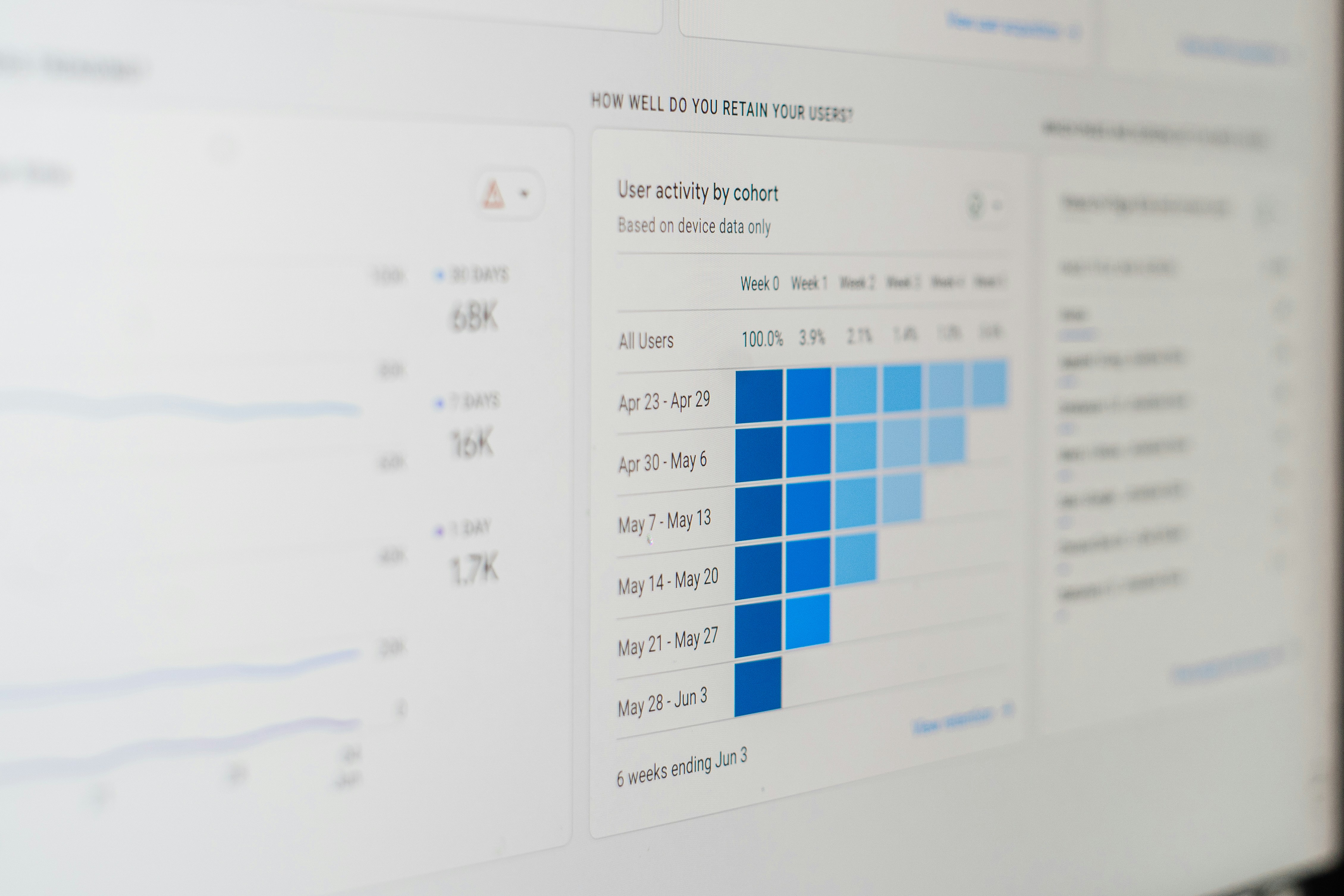
Introduction to Looker Studio and Google Analytics
Looker Studio, a platform designed for data analysis and visualization, is increasingly being recognized for its ability to transform raw data into actionable insights. Integrating Looker Studio with Google Analytics amplifies the analytical capabilities of businesses, allowing them to visualize their web data more effectively. This collaboration is particularly advantageous for companies striving to make informed decisions based on their online performance metrics.
Google Analytics serves as a powerful tool for tracking and reporting website traffic, providing essential insights into user behavior, acquisition channels, and overall engagement. When combined with Looker Studio, the data captured by Google Analytics can be presented in a more meaningful and visually appealing manner. This integration enables users to create customizable dashboards tailored to their specific analytical needs, which can facilitate a deeper understanding of data trends over time.
The primary purpose of using Looker Studio alongside Google Analytics is to enhance data visualization. While Google Analytics provides a plethora of data, the default reporting options may be limited in their customization capabilities. Looker Studio allows users to create interactive dashboards that showcase key performance indicators (KPIs) and metrics, making the data easily interpretable at a glance. Such visual representations not only simplify reporting but also make it easier for stakeholders to comprehend complex data sets.
Moreover, this integration streamlines the reporting process, allowing businesses to pull in data from Google Analytics effortlessly. Users can automate their reporting, saving valuable time and effort while ensuring that the information they are presenting is always up-to-date. This efficiency is crucial for agile decision-making, as companies can respond to performance trends in real time, maximizing their online strategies effectively.
Setting Up Your Looker Studio Account
To begin leveraging the power of the Looker Studio Google Analytics dashboard, you first need to set up your Looker Studio account. Initiating this process is straightforward, and it is essential to follow each step effectively to ensure seamless integration with your Google Analytics data.
Start by navigating to the Looker Studio website. If you have a Google account, you can utilize that to sign in. If you do not have a Google account, you will need to create one, as it is a prerequisite for accessing Looker Studio. Once signed in, click on the “Create” button to start your new Looker Studio project.
Next, you will need to grant permissions for Looker Studio to access your data. It is important to allow these permissions, as they facilitate the connection to your Google Analytics account. In order to do this, select “Data Sources” from the menu, then “Create Data Source.” A list of options will appear, from which you must choose “Google Analytics.” You may be required to log in again to confirm your identity and authorize the necessary permissions.
After successful authorization, you will be presented with all available Google Analytics accounts. Select the account that you wish to link with your Looker Studio dashboard. You’ll then be able to choose the specific views, metrics, and dimensions relevant to your reporting needs. Once you’ve made your selections, click on the “Connect” button. This action establishes the link between the Looker Studio Google Analytics dashboard and your analytics data, enabling you to pull in relevant insights effectively.
Now that your Looker Studio account is set up and connected to Google Analytics, you are equipped to begin building your dashboard. This setup is crucial for accessing and visualizing your data in a meaningful way, ultimately aiding in making informed business decisions.
Understanding Key Metrics in Google Analytics
Google Analytics is an invaluable tool for website owners, providing insights into user behavior and site performance through a variety of metrics. When designing a Looker Studio Google Analytics dashboard, it is essential to focus on key metrics that offer comprehensive insights into website activity. Understanding these metrics can help identify trends, improve user engagement, and enhance overall site effectiveness.
One of the most fundamental metrics is page views, which indicates the total number of times a page is viewed. This metric is crucial as it measures the volume of traffic to specific content and helps in assessing the popularity of pages over time. Pairing page views with another critical metric, the bounce rate, offers deeper insights. The bounce rate represents the percentage of visitors who leave the website after viewing only one page. A high bounce rate may suggest that visitors are not finding what they expect or that the landing pages may need improvement.
Another important metric is session duration, which measures the average length of time users spend on a website. Longer session durations typically indicate more engagement; hence, monitoring this metric can help assess the effectiveness of content strategies. Additionally, analyzing user demographics allows website owners to understand their audience better. This metric includes data on the age, gender, and location of users, providing crucial insights that can inform targeted marketing strategies and content creation.
In summary, focusing on key metrics like page views, bounce rate, session duration, and user demographics is vital when developing a Looker Studio Google Analytics dashboard. These metrics not only help in tracking website performance but also play a significant role in making data-driven decisions that enhance user experience and optimize online presence.
Designing Your Looker Studio Dashboard
When creating a Looker Studio Google Analytics dashboard, the design plays a crucial role in conveying information effectively. An intuitive layout should be your first consideration, as it sets the stage for user interaction. Start by determining the primary goals of your dashboard and the key metrics you want to highlight. This will guide how you structure your dashboard, ensuring critical data is easily accessible to users.
The choice of color scheme is equally important. Utilizing a limited palette helps to avoid overwhelming users, while contrasting colors can be used strategically to draw attention to significant data points. Neutral backgrounds can enhance readability, while vibrant accent colors can highlight essential metrics. Ensure that color choices are consistent throughout to create a cohesive look that fosters trust and professionalism.
Chart choices must also be made thoughtfully to maximize data comprehension. Rely on familiar chart types that resonate well with users; for instance, line graphs for trend tracking, bar charts for comparisons, and pie charts for part-to-whole relationships. Offering various visualization types encourages diverse interpretations of the data presented, ultimately enhancing the decision-making process.
Data organization is a vital aspect of an effective Looker Studio dashboard. Group related metrics to create logical sections within your dashboard, allowing users to navigate seamlessly from one dataset to another. Use headers and labels to clarify the purpose of each section and ensure that all visual elements are appropriately labeled and easy to understand. Implementing tooltips can further assist in providing specific context without cluttering the workspace.
Ultimately, the design of your Looker Studio Google Analytics dashboard should prioritize user experience, focusing on clarity and ease of navigation. By adhering to these principles, users can effectively interpret and act upon the data presented, leading to informed decision-making and optimized performance metrics.
Incorporating Advanced Visualizations
Incorporating advanced visualizations into your Looker Studio Google Analytics dashboard is essential for extracting meaningful insights from your data. Various chart types, heat maps, geo maps, and other visualization tools offered by Looker Studio can significantly enhance data presentation and improve user comprehension. By effectively utilizing these features, one can transform raw data into informative visual representations that facilitate in-depth analysis.
To begin with, selecting the right chart type is crucial. For instance, line charts are ideal for tracking metrics over time, allowing users to identify trends and patterns. Bar and column charts serve well when comparing different categories, while pie charts can effectively showcase proportions within a dataset. Each of these visual elements provides clarity and aids in decision-making processes when analyzing Google Analytics data.
Heat maps and geo maps represent advanced visualization techniques that can elevate your dashboard further. Heat maps can display user engagement levels across different sections of a webpage, highlighting areas that attract maximum interaction. By incorporating these visualizations, users can quickly identify which segments of their site require further optimization. On the other hand, geo maps offer geographical insights, showcasing user distribution across regions. This feature is particularly valuable for businesses looking to tailor their marketing strategies based on location-specific data.
Moreover, Looker Studio provides additional tools such as scatter plots and funnel visualizations that can be utilized effectively. Scatter plots allow users to visualize relationships between metrics, while funnel visualizations offer insights into customer journeys and conversion rates. Integrating these advanced visualizations into your Looker Studio Google Analytics dashboard enriches your data storytelling, empowering stakeholders to make informed decisions grounded in data-driven insights.
Customizing Your Dashboard for Unique Business Needs
Creating a tailored Looker Studio Google Analytics dashboard is essential for effectively meeting the specific objectives of a business. Beyond the default settings and standard metrics, customization allows you to align the dashboard with unique marketing goals, audience interests, and key performance indicators (KPIs). This process starts with the creation of custom fields that reflect particular data points relevant to your business. For instance, businesses can add dimensions such as customer demographics or behavior patterns, enabling a more targeted analysis.
Filters are another powerful tool in customizing your Looker Studio dashboard. By applying specific filters, users can hone in on the data that matters most for their strategies. This might include filtering by traffic sources to assess the performance of different marketing channels or segmenting audiences based on geographical location. These adjustments not only streamline data analysis but also provide deeper insights into user engagement and conversion rates, ensuring that your business can pivot quickly in response to market trends.
Segments also play a critical role in refining your dashboard. By creating unique segments, businesses can analyze subsets of data, such as users who completed a specific action or visitors from a particular campaign. This segmentation allows for a nuanced understanding of customer behavior, which can inform future marketing strategies. Additionally, integrating time comparisons helps track performance over specified periods, allowing businesses to measure growth, identify seasonal trends, and assess the impact of marketing initiatives. Ultimately, a customizable Looker Studio Google Analytics dashboard empowers businesses to interpret data in a way that aligns with their unique objectives, thereby enhancing their overall decision-making process.
Sharing and Collaborating on the Dashboard
One of the key features of the Looker Studio Google Analytics dashboard is the ability to share and collaborate effectively with team members and stakeholders. This functionality enhances both communication and understanding of the insights derived from the data stored within the dashboard. Sharing options are not just limited to providing access; they also include setting appropriate permissions to suit varying levels of collaboration.
When sharing the Looker Studio dashboard, the owner can manage access rights. Permissions can be categorized into viewer, editor, or administrator roles. Viewers can access the dashboard without making any changes, while editors can modify the dashboard content. Administrators possess the highest level of control, allowing them to alter permissions and settings. It is essential to grant permission judiciously to ensure data security while fostering collaboration.
Collaboration features within Looker Studio facilitate real-time communication and feedback. Team members can leave comments directly on the dashboard to discuss specific data points or trends. This streamlines the decision-making process, allowing for quick adjustments and collective brainstorming based on solid data. To maximize the effectiveness of feedback, it is advisable to establish best practices, such as regularly scheduled review sessions to discuss insights generated from the dashboard, ensuring alignment across the team.
Moreover, leveraging the sharing capabilities in a thoughtful manner helps in making data-driven decisions as a cohesive unit. Regularly sharing insights gathered from the Looker Studio Google Analytics dashboard with stakeholders keeps everyone informed and engaged. Ultimately, promoting a culture of shared responsibility and open dialogue around data can significantly enhance an organization’s performance by enabling informed strategic planning.
Troubleshooting Common Issues in Looker Studio
Utilizing Looker Studio in conjunction with Google Analytics can yield valuable insights; however, users may sometimes encounter challenges that hinder performance or data accuracy. Addressing these common issues effectively can enhance the overall functionality of your dashboard.
One frequent problem revolves around data discrepancies. These may arise from differences in data collection intervals or filters applied within Google Analytics. To mitigate this, ensure that the date ranges in Looker Studio align with those set in Google Analytics. Additionally, check your configurations for filters to avoid misunderstandings in reported figures. If inaccuracies persist, consider refreshing the data connection to synchronize any recent updates from Google Analytics.
Visualization errors can also pose significant obstacles. Users often find that charts or graphs may not accurately represent the data they intend to display. These issues can typically be traced back to the settings used within Looker Studio. Review each visualization’s configuration, such as the dimensions and metrics selected. Adjusting these settings may rectify the discrepancies and result in a clear and informative visual representation of your data.
Another common challenge stems from connectivity problems between Looker Studio and Google Analytics. If users notice that data is failing to load or appears incomplete, verify that the necessary permissions in Google Analytics are granted. Users must also ensure that the correct Google account is connected to Looker Studio. Sometimes, re-establishing the connection by disconnecting and reconnecting Google Analytics can resolve lingering connection issues.
By recognizing and addressing these common pitfalls, users can enhance the functionality of their Looker Studio Google Analytics dashboard, ensuring a reliable and insightful data experience.
Resources and Further Reading
To further enhance your understanding and application of the Looker Studio Google Analytics dashboard, it is essential to leverage a variety of resources that can provide additional insights and detailed guidance. Below is a compilation of valuable links and references that can serve as your gateway to mastering this powerful tool.
For any inquiries regarding Looker Studio, including how it can streamline your data reporting processes, you can reach out through the following contact page: Contact Us. This platform is designed to address specific questions you may have and connect you with experts who can provide tailored support.
If you are looking for advanced reporting services that can take your dashboard to the next level, consider reviewing the offerings available at Looker Studio Reporting. This page outlines an array of service options focused on optimizing your analytics experience, ensuring that you receive comprehensive insights tailored to your unique business goals.
Additionally, for continuous learning and staying updated with the latest trends in data analytics, you are encouraged to explore the Blog. Here, you will find a wealth of information and articles that delve into various aspects of Looker Studio, Google Analytics, and related topics, perfect for enhancing your knowledge and skills.
Utilizing these resources not only boosts your proficiency with the Looker Studio Google Analytics dashboard but also fosters a culture of continuous learning, ensuring that you remain informed about the best practices and innovations in data analytics.


