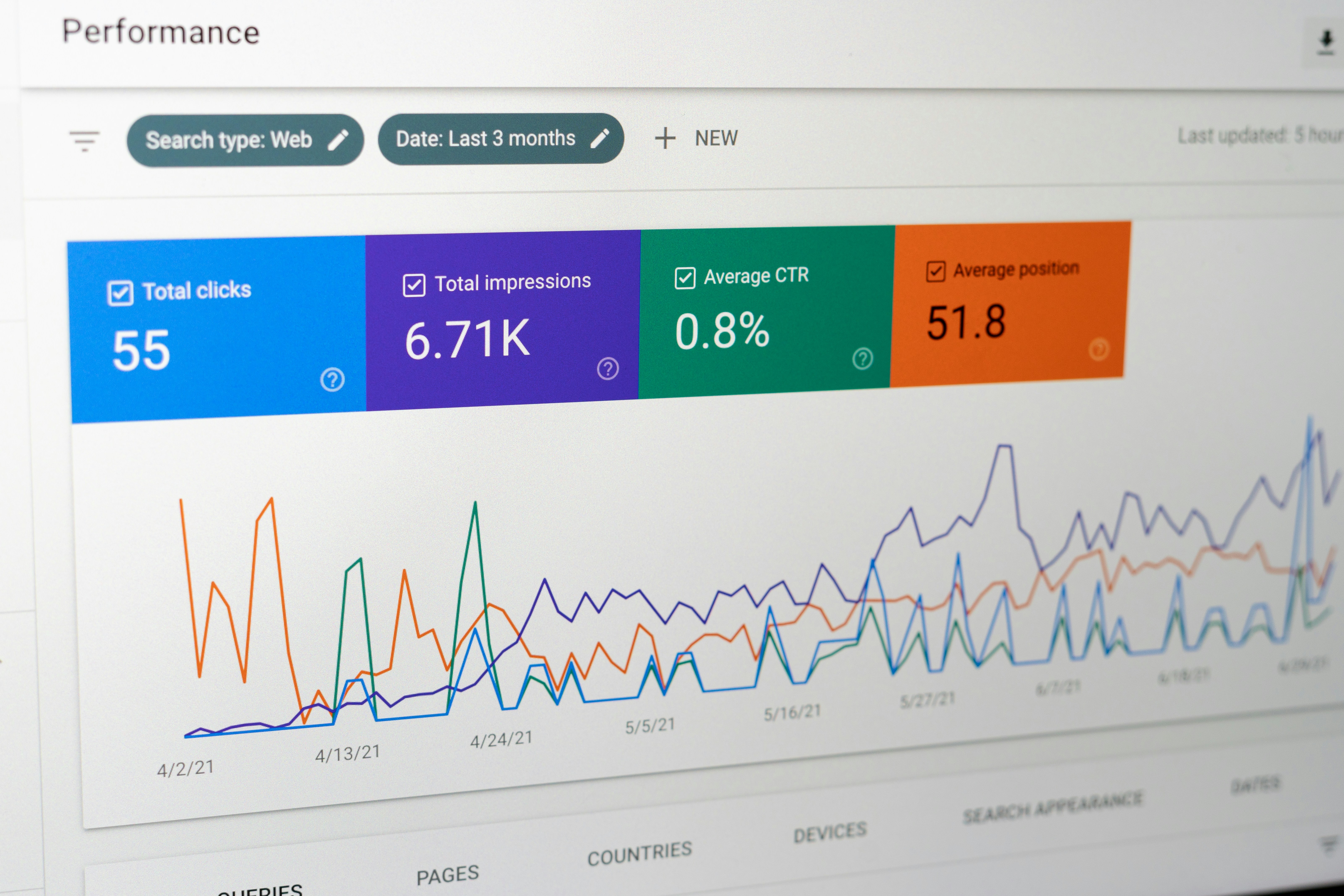
Introduction to Looker Studio
Looker Studio, a powerful business intelligence tool, offers comprehensive analytics and data visualization capabilities that empower organizations to make informed decisions based on data-driven insights. At its core, Looker Studio facilitates the exploration of data through interactive dashboards and customizable reports, making it an invaluable asset for professionals looking to derive meaningful information from large datasets.
The primary features of Looker Studio include its ability to connect to various data sources, allowing users to access real-time information seamlessly. Users can create visually appealing dashboards that showcase key performance indicators (KPIs) and trends, enabling quick comprehension of complex data sets. The tool also supports advanced data modeling, allowing analysts to define relationships between various data points and derive more profound insights through calculated metrics and visual representations.
The importance of Looker Studio in data visualization cannot be overstated. In today’s data-centric world, organizations are increasingly reliant on visual tools to interpret vast arrays of information. Looker Studio enhances data readability through its intuitive interface, combining an array of visual elements such as graphs, charts, and maps. As a result, stakeholders at all levels can engage with data more effectively, facilitating smarter decision-making processes and boosting overall business performance.
The target audience for Looker Studio includes data analysts, business intelligence professionals, and decision-makers in various sectors. Organizations ranging from small businesses to large enterprises can benefit from Looker Studio’s capabilities, particularly those seeking to improve their analytics proficiency. By adopting this tool, they can harness the full potential of their data, turning it into a strategic asset that drives growth, innovation, and competitive advantage in the marketplace.
What is an Analytics Canvas?
The analytics canvas is a fundamental component within Looker Studio that serves as a workspace for users to create, manipulate, and visualize data in a user-friendly interface. This canvas acts as a blank slate, allowing users to present their data in various formats, such as charts, tables, and graphs. The significance of this blank slate cannot be overstated, as it provides the flexibility to accommodate different types of data presentations based on the specific needs and objectives of the user.
The primary purpose of the analytics canvas is to facilitate the process of transforming raw data into insightful visualizations and reports. Users can drag and drop elements onto the canvas to construct their desired layouts, thereby removing barriers to accessibility and usability. Whether one is aiming to generate a straightforward line chart or a more complex dashboard combining multiple visualizations, the analytics canvas enables the seamless integration of diverse datasets into a cohesive presentation.
Understanding Canvas Size in Looker Studio
The concept of canvas size in Looker Studio plays a pivotal role in the design and readability of reports and dashboards. A canvas serves as the workspace where users can visualize data, and its dimensions directly influence how information is displayed. An appropriately sized canvas can enhance the interpretability of visualizations, allowing users to digest the information effectively. On the other hand, an improperly sized canvas may lead to clutter, making it difficult for stakeholders to grasp key insights.
Looker Studio offers various canvas size options that cater to different analytical needs. Users can typically choose between standard sizes such as ‘small,’ ‘medium,’ and ‘large,’ and may also have the flexibility to set custom dimensions. The choice of canvas size should be aligned with the type of data being presented and the audience’s viewing preferences. For instance, a larger canvas can be beneficial for detailed analyses that require showcasing multiple data points or complex visualizations, while a smaller canvas might suffice for simpler overviews or summary reports.
In selecting an appropriate canvas size, users must consider factors such as the complexity of the data, viewer preferences, and the medium of presentation. For instance, if reports are primarily viewed on mobile devices, a smaller or responsive canvas may enhance user experience. Conversely, for presentations projected in large meeting rooms, larger canvases can facilitate better visibility. Ultimately, understanding canvas size in Looker Studio is crucial for optimizing the presentation of analytics, ensuring clarity, and enhancing the overall effectiveness of the dashboard or report.
Why Canvas Size Matters
In the realm of data visualization and reporting, selecting the appropriate canvas size in Looker Studio is crucial for achieving clarity and effectiveness. The canvas serves as the space where data insights are presented, and its dimensions can significantly influence the user experience. A well-chosen canvas size ensures that stakeholders can easily interpret the information, allow efficient navigation, and improves engagement with the data.
When a report is designed with a canvas size that is either too large or too small, it can result in various challenges. For instance, if the canvas is excessively large, users may find themselves overwhelmed by the amount of space, making it hard to focus on specific data points. Conversely, a canvas that is too small can lead to cramped visuals, where graphs and charts overlap or become unreadable. Both scenarios may result in confusion or misinterpretation of the insights being conveyed. For example, a large dataset formatted on a petite canvas could shrink critical data representations, ultimately obfuscating vital information required for decision-making.
Furthermore, the choice of canvas size can impact the overall aesthetic appeal and professionalism of the report. A report that appears cluttered or excessively spacious may not instill confidence in its analysis. On the other hand, an appropriate canvas size, tailored to the specific content, can enhance readability and maintain a visual balance between text and graphics. This facilitates an environment where stakeholders can derive valuable insights swiftly.
Ultimately, understanding the implications of canvas size not only enhances data visibility but also promotes effective communication of insights. By investing time to select the right size for the intended report, one can greatly improve the user experience and ensure that stakeholders receive the critical information needed to make informed decisions.
Available Canvas Size Options
Looker Studio offers a variety of canvas sizes to cater to the diverse reporting needs of its users. Understanding the available options and their appropriate usage is essential for creating effective and visually appealing reports. The standard canvas sizes include A4 and Letter, which are commonly used formats in professional settings.
The A4 size measures 210 mm x 297 mm (8.27 inches x 11.69 inches) and is particularly popular in countries that follow the ISO paper size system. It is well-suited for detailed reports, documents, and presentations. On the other hand, the Letter size, measuring 216 mm x 279 mm (8.5 inches x 11 inches), is predominantly used in the United States and Canada. This format is ideal for most business and academic reports, as it provides ample space for text and visuals without compromising clarity.
In addition to these standard sizes, Looker Studio allows users to customize their canvas dimensions. Customizable options enable users to adjust the width and height according to specific requirements, thus accommodating specialized reports or presentations where unique sizing may enhance the viewing experience. This flexibility is particularly beneficial for dashboards that need to fit within specific layout constraints or when displaying data that requires a non-standard format.
When choosing an appropriate canvas size, it is crucial to consider the nature of the report. For instance, reports that involve detailed data visualization may benefit from larger sizes, allowing more room for graphs and charts. Conversely, concise reports or those intended for quick insights might be better suited to the standard sizes, ensuring information is clearly presented without excessive white space. Understanding these options can significantly improve the effectiveness of your reporting in Looker Studio.
Best Practices for Sizing Your Canvas
When it comes to determining the optimal canvas size for your Looker Studio reports, several key factors should be taken into account. First and foremost, understanding your target audience is essential. If your report is designed for stakeholders who will be presenting data to clients or executives, a larger canvas that allows for detailed visualizations may be preferable. Conversely, reports that will be primarily consumed on mobile devices may require a more compact design to ensure usability.
The complexity of the data being presented is another vital consideration. More intricate datasets, which require multiple charts or graphs to convey comprehensive insights, typically benefit from a wider canvas. This facilitates an organized layout that makes the information easily digestible. However, it is crucial to avoid overloading your report with too much information; excessive clutter can detract from the clarity of your findings.
Additionally, the intended use of the report plays a significant role in determining the appropriate canvas size. For interactive dashboards meant for real-time data monitoring, a flexible canvas that can be resized may be advantageous. In contrast, static reports intended for distribution should prioritize clarity and printability over flexibility. Furthermore, optimizing content layout for both viewing online and in print can enhance accessibility for different audiences.
Common mistakes to avoid include failing to consider the resolution of the devices on which the report will be viewed and neglecting to set appropriate margins and spacing. Also, it’s vital to ensure that the most critical information is positioned in the center of the canvas, as this is often the first area viewed by audiences. By taking these best practices into account, you can create effective reports that communicate data insights clearly and effectively.
How to Adjust Canvas Size in Looker Studio
Adjusting the canvas size in Looker Studio is a straightforward process that can significantly enhance the visual appeal and functionality of your reports. Whether you’re starting a new report or modifying an existing one, understanding how to change the canvas size will ensure that your data is presented clearly and effectively.
To begin, if you are creating a new report, launch Looker Studio and select the “Create Report” button. Upon entering the report configuration screen, you will notice a sidebar on the right side of the interface. Here, look for the “Page Settings” section, where you can find various options to customize your report’s layout, including the canvas size.
In the “Page Settings,” you will encounter options to set the canvas width and height. Looker Studio typically offers several preset dimensions designed for common use cases, such as presentation mode or web dashboards. Selecting one of these presets is often the easiest method to adjust the canvas size. However, for more tailored results, you can input specific values for width and height, allowing for complete control over how your report looks.
If you are working with an existing report, the process is nearly identical. Open the report you wish to modify and navigate to the same “Page Settings” in the right-hand sidebar. You can then alter the canvas dimensions as needed. Changes will take effect immediately, allowing you to preview how the new size impacts the overall layout of your report elements.
Don’t forget to save your changes after adjusting the canvas size to ensure your updated layout is preserved. With these easy steps, adjusting the canvas size in Looker Studio becomes a seamless process, allowing for a customized presentation of your analytics data that suits your specific needs.
Case Studies: Effective Use of Canvas Size
Organizations across various industries have successfully maximized their analytics capabilities by effectively utilizing canvas sizes in Looker Studio reports. One relevant case study is that of a major retail chain that faced challenges in its data presentation. The team realized that their reports lacked clarity due to inappropriate canvas sizing, which led to overcrowded visuals and impaired decision-making. After reassessing their approach to canvas sizes, the team adjusted their reports to include clearer, consistent sizing that emphasized key performance indicators (KPIs). As a result, the clarity improved significantly—enabling stakeholders to quickly interpret data trends and make informed strategic decisions that increased quarterly sales by 15%.
Another compelling case involves a healthcare organization that employed Looker Studio for patient data analysis. Their initial reports feature overcrowded graphs and shrunk text, making it difficult for clinicians to derive insights on patient care. By adopting an optimal canvas size, this institution created more focused visualizations that highlighted critical data points. The improvement in readability enabled healthcare professionals to better grasp patient outcomes and streamline treatments based on actionable insights. Subsequently, the organization reported a 10% reduction in patient readmission rates due to enhanced data-driven decisions.
An educational institution also leveraged proper canvas sizing to refine its annual performance reports. Initially, the reports consisted of multiple small-sized charts that diluted the overall narrative. By strategically expanding key sections on the canvas, the institution was able to provide a clearer picture of student performance and engagement metrics. This thoughtful resizing allowed faculty and administration to identify areas needing improvement and led to a 20% increase in academic outcomes over the subsequent year, evidencing that effective data storytelling can drive impactful changes.
Conclusion and Next Steps
Throughout this blog post, we have explored the fundamental aspects of canvas size in Looker Studio and its significant impact on data visualization and reporting. The importance of selecting the appropriate canvas size cannot be overstated, as this decision directly influences how easily stakeholders can comprehend the presented data. A well-chosen canvas size enhances readability and interactivity, allowing users to engage with the data more effectively. By understanding the various dimensions available in Looker Studio, users can tailor their analytics presentations to better suit their audience’s needs.
We encourage readers to experiment with different canvas sizes in their own Looker Studio projects. Each project may require a unique approach, and playing with size options may reveal new opportunities for improved clarity and engagement. As you begin to apply these insights, consider how the chosen dimensions can highlight critical data points, streamline reporting, and perhaps even uncover trends that were previously obscured.
For those looking to deepen their understanding of Looker Studio, we recommend consulting additional resources. The official Looker documentation offers comprehensive guides and tutorials that delve into advanced features, including canvas manipulation and other visualization techniques. Online forums and community groups can also provide valuable insights and tips from experienced users. Engaging with these materials can further enhance your skills and understanding of Looker Studio’s vast capabilities, ultimately benefiting your analytical endeavors.
In reviewing the key points discussed, it is clear that the canvas size in Looker Studio is not just a trivial aspect of design; it is a crucial element that contributes to effective data storytelling. By prioritizing thoughtful size selection, you can significantly enhance the overall impact of your analytics presentations.